Analytic Partners
GPS Enterprise — the enterprise-tier marketing analytics platform, carrying a team from raw data through to a decision.
- UI Designer
- GPS Enterprise
- January 2021 – March 2024
- Marketing analytics, enterprise SaaS
- Web
Impact
$13M
in additional revenue after rebuilding the flagship product from Angular to React.
25%
year-over-year revenue growth after modernizing legacy enterprise software.
85%
less time spent collecting data, once collection and review were consolidated.
Three tools, one intelligence layer, one route from data to decision.
GPS Enterprise is built on a foundation of technologies that streamline data management, modelling, forecasting and scenario planning, with security at the core. It brings together three fully integrated tools — Adapta for data, AMP for analytics and Prophet for decisioning — powered by the proprietary ROI Genome intelligence layer, so the journey from data to decision-making happens in one place rather than across four.
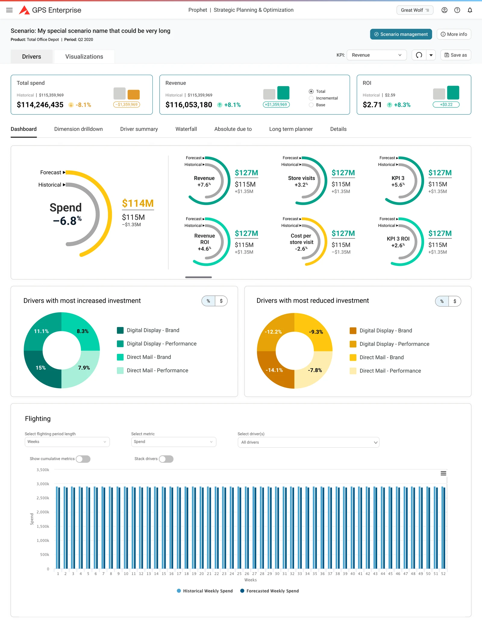
My work ran across the platform: the dashboards and reporting surfaces, the scenario-planning flows inside Prophet, and the component patterns that hold them together. Most of it came down to one problem — taking dense modelling output like model fit, incremental revenue, diminishing returns and driver contribution, and putting it on screen so a marketer can act on it without a data-science background.
- Dashboards, reporting and data-visualization surfaces
- User-flow mapping for scenario planning, simulation and optimisation
- Reusable UI components and patterns across the three tools
- Prototyping and iterative review with analysts, marketers and engineering
- Accessibility and inclusive design through the lifecycle
The questions the platform had to answer.
- 01How might we take a marketer from raw data to a decision without a detour through the analytics team?
- 02How might we make a scenario — its inputs, its simulation, its optimisation — readable at a glance and still editable in detail?
- 03How might we show model quality (fit, confidence, benchmark) so someone trusts the number they are about to act on?
- 04How might we keep data analysts, marketers and business leaders looking at the same picture of the same quarter?
- 05How might we standardise documentation and specification so design intent survives the hand-off to engineering?
Six areas of design work.
Adapta — data
- Dataset creation, editing and batch review
- Due dates and pending-review states, so data owners can see what is outstanding
- Diminishing-returns values viewable and editable in place
AMP — analytics
- Insight views for spend and incremental revenue, with period-over-period movement
- Model-fit charts plotting actual against predicted net sales
- Data score and ROI Genome benchmark score surfaced together
Prophet — decisioning
- Scenario management as the landing surface, with datasets one step away
- Input tabs for simulation, optimisation and non-marketing drivers
- Output tabs for summary, driver summary, waterfall and detail
From whiteboard to flow
- Scoping and design sessions worked through test-versus-control structure, cell counts, date ranges and confidence levels before anything reached a screen
- Flows mapped end to end and colour-coded by surface type — landing page, full page, modal, tab — so engineering could read the build from the map
- Work-in-progress branches marked as such rather than quietly omitted
A shared vocabulary
- Tables, cards, modals, tabs and empty states built once and reused
- Illustrated empty states that name the next action
- Patterns documented so a new surface starts from the existing language
Setup and administration
- Sub-accounts and periods, milestone configuration and executive dashboard review
- Kept off the daily path but never more than a tab away
- Formal review steps and documentation standards agreed with the team
Less time collecting, more time deciding.
Faster to the number. Consolidating collection and review cut data collection time by 85% — the figure the engagement was measured on.
One picture for three audiences. Analysts, marketers and business leaders worked from the same dashboards and the same definitions, which took most of the translation work out of the middle of the process.
A vocabulary that scaled. Three tools shipped under one interface language, so a new surface inherited its patterns instead of inventing them.
“I’m happy to recommend Todd Crawford for his contributions as a UI designer. During our time working together at Analytic Partners, a data analytics company, I’ve observed his consistent delivery of high-quality designs that meet client and company expectations. Todd has a track record of translating complex data management and visualization projects into visually compelling, responsive, and user-friendly interfaces. His unique blend of creativity and technical proficiency is evident in his work, and his collaborative nature makes him a standout team member.”
Misha Holzman
Manager, UI Design